Art Style Decision
Originally, Alchemistie used full-color pixel art. A full-color art style has many advantages, including higher levels of detail, using color to distinguish between friendly NPCs and enemies, and simulated lighting effects. When executed well, this style probably has a higher ceiling for visual appeal than restricting to an 8-color, 4-color, or even 2-color palette. So why did I make the change to a 1-bit black and white palette?

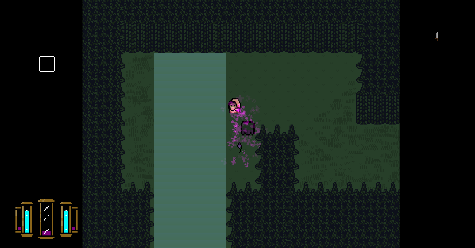
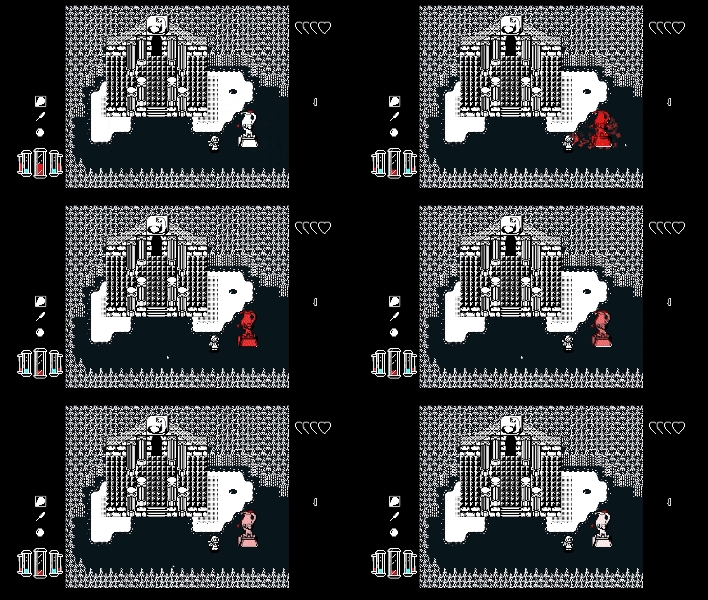
The first, and most important reason is for communicating mechanics to the player. In the image above, you can see Mistie spraying a purple potion onto a flower. In order to communicate that the flower was gaining the poison status effect, a purple indicator meter appeared above and to the right of the flower. This would fill as the flower got more of the potion sprayed onto it. Once full, the status marker would then gain a purple circle around it and the poison status would take effect. This method of communicating was distracting and obtrusive. In situations where several enemies or NPCs were in the same room, this would get overwhelming and lose clarity quickly. Swapping to black and white pixel art alleviates this problem, as the color of the status is now gradually drawn over an object until it reaches full coverage. A distortion effect is then applied while the status is applied to show that it has taken effect and the opacity slowly fades to indicate the status effect wearing off.

GameMaker Studio 2's draw functions can easily have colors swapped in for any given sprite (most strongly affecting any pixels that are completely white), thus allowing enemies to be drawn in different color variations without the need for additional art to be made. Having this freedom eventually led to mechanical implementations like dealing extra damage when hitting an enemy with it's complimentary color, or implementing color mixing such as applying a blue and red potion to an enemy for it to then turn purple and have a different status effect applied. Ultimately this culminated in giving the player the ability to choose which status effects are associated with which colors (more on this in the future).
The next reason is visual distinction. Choosing a pixel art style is not enough to set apart a game visually, but reducing the palette to only 2 colors gives a certain striking quality. The most popular 1bit pixel art games that I can think of are Downwell and Minit. The contrast is striking and having fewer but bolder colors makes the game easier to remember and leave a lasting impression.
The final reason is ease of creation. I am not an artist, and I'm barely a programmer. Many choices during my game development journey were driven by my lack of skill, such as choosing a game engine that is easy to learn and an art style that is easier to create in. I chose this art style so I could iterate quickly and learn some art fundamentals in the process. While I don't think my art is much better than a temporary placeholder that will be professionally redesigned later, I think it does allow me to get my ideas across despite my lack of artistic prowess.
Alchemistie
Use potions to deal huge damage to enemies or creatively solve puzzles, but each ingredient has any effect you choose...
| Status | In development |
| Author | Brothahman |
| Genre | Adventure, Action, Puzzle |
| Tags | Dungeon Crawler |
More posts
- Market ResearchJun 12, 2024
- AlchemistieJun 11, 2024
Leave a comment
Log in with itch.io to leave a comment.